[ 9 ]
Visualizing the Shape of Your Product Experience
“The Website Knows Me and What I Want”
I first came across experience goals in 2009 while working on the Sonyericsson.com redesign. The internal UX team at Sony Ericsson used them as a way to work through their vision for the user experience and its division across the life cycle stages of the product.
By defining goals for what we wanted the experience to feel like, we had a different starting point for approaching requirements. Rather than jumping straight in and defining what a need would correspond to in terms of content or features, we defined three overarching experience goals that should apply to the website and a user’s experience; one of them was “The website knows me and what I want.” Next we broke down each overarching experience goal into more specific experience statements for certain points across the product life cycle. For example, the experience goal “It knows me and what I want” was broken into “It gives me recommendations” at the consideration stage in the product life cycle.
Many organizations and projects are driven by the business’s needs and a list of requirements or user stories. The latter is not to be confused with user needs; just because it has the word user in the title doesn’t mean they are grounded in actual user needs. Writing user stories, in whichever format they take, is easy in the sense that we can all write “As a <type of user> I want to <goal/ desire/capability> so that <benefit/why>.” User stories can, however, become something that we almost churn out, and because we’re constantly writing, and therefore also thinking “As a user…,” we can fool ourselves into thinking that we’re automatically considering user needs. What users need, however, often starts at a deeper level.
To fully understand what users need, we first need to understand the humans behind the users. We need to know their backstories and be able to identify their desired outcomes at each point, as well as what it is they are trying to avoid. Insights about these backstories and pleasure and pain points for specific users provide us with more valuable information than a simple statement around what a user should be able to do.
That’s not to say that user stories aren’t valuable. The part of user stories that includes the “...so that <benefit/why>” helps ensure that a reason for the requirement is included, of course. But starting one level above that—by defining an overall vision for the experience through the use of something like experience goals—enables the product team to add a more nuanced perspective to the requirements. It also helps ensure that a through line runs through the experience, that red thread. Experience goals are also a great tool for mapping out what the experience across your website and app should feel like: they can help you visualize the desired emotional shape of the experience for the user, something that helps make it more tangible for the whole product team.
The Shape of Stories
In all types of narratives, there’s an ebb and flow. At times, things are tough, and we’re not exactly sure how the story is going to turn out. Then something happens that lifts the mood, and it seems more likely that the protagonist will achieve their objective. As Nancy Duarte suggests, all great talks have a certain shape to them. The same applies to stories.
Going all the way back to the time of Aristotle, people have tried to define the optimal structure of films, plays, and stories in general. Some stories start with the status quo, others in a more dire situation, and still others in times of good fortune or happiness. When it comes to product design and the problems and opportunities we help our users with, the experiences we design also tend to have a shape to them, even if we don’t think about them that way.
By looking at typical structures from traditional storytelling, we can draw inspiration and learn a lot about how to define and visualize the experiences we’re designing. As the saying goes, “A picture is worth a thousand words.” When it comes to aligning teams, clients, and internal stakeholders, having something visualized can help ensure that everyone is on the same page. As we’ll cover, visualizing the experience also helps us think it through from the start, identify typical patterns compared to other similar experiences, and determine where we want or need to place an emphasis. In the same way, typical structures in traditional storytelling help storytellers and scriptwriters in their work. What follows are some of the most well-regarded story structures.
Campbell’s The Hero’s Journey
One of the most famous story structures is Joseph Campbell’s The Hero’s Journey (Figure 9-1). In his 1949 book The Hero With a Thousand Faces, Campbell describes the basic narrative pattern as follows:
A hero ventures forth from the world of common day into a region of supernatural wonder: fabulous forces are there encountered and a decisive victory is won: the hero comes back from this mysterious adventure with the power to bestow boons on his fellow man.1
The Hero’s Journey is typically illustrated as a circle with a dividing line, symbolizing the divide between the known and the unknown world, also referred to as the ordinary world and the special world. The hero’s journey begins in the known world, where he gets a call to adventure that leads him over the first threshold and into the unknown world. In total, the hero goes through 17 stages and returns back to the known world with his reward after having undergone the ordeal, where he overcomes his main obstacle or enemy. In addition to the outer journey, there is also an inner journey for the hero that starts with a limited awareness of the problem and ends in mastery (Figure 9-2).
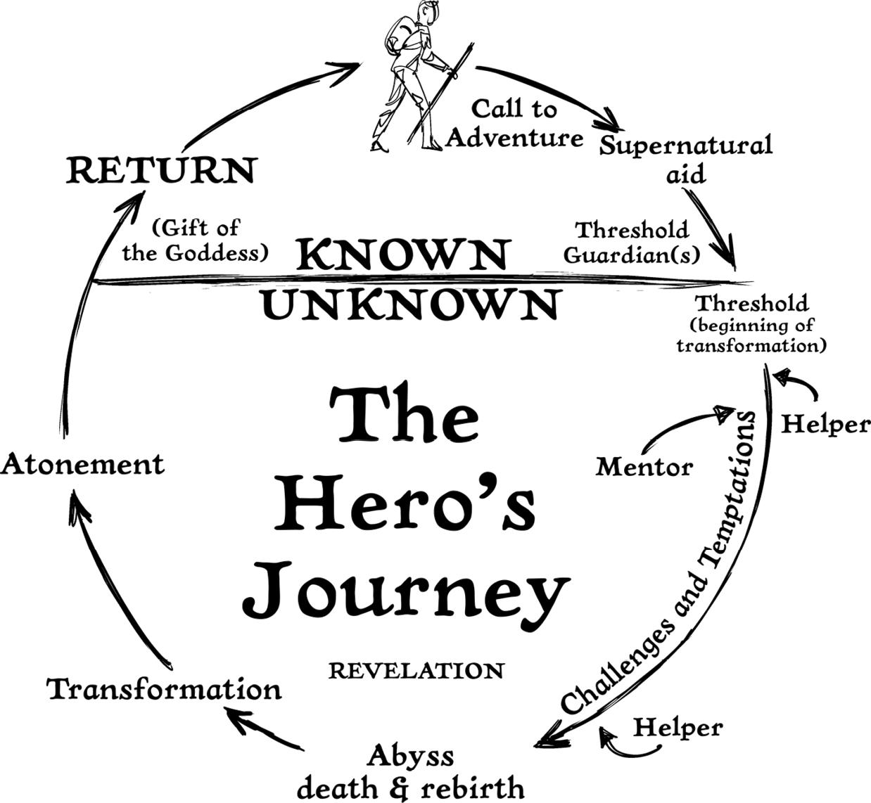
Figure 9-1
The Hero’s Journey
The inner and outer journey is similar to what our users may experience while using the products and services that we design. The outer journey includes the steps and actions that a user takes in completing a task or achieving a goal. The inner journey, on the other hand, consists of the user’s thoughts and emotions while moving through each step. It’s the inner journey that, in the end, governs what the outer journey —determining, for example, whether the user decides to takes action or not, or leave your website in favor of a competitor’s.
The unique combination of the inner and the outer journey is what results in no two journeys being the same. Outer journeys tend to bear more similarities among users than inner journeys, which is why we tend to focus on them more. However, with a growing number of touch points, even outer journeys don’t always follow one clear path, and this also places increasing emphasis on the inner journey and understanding each user’s scenarios.
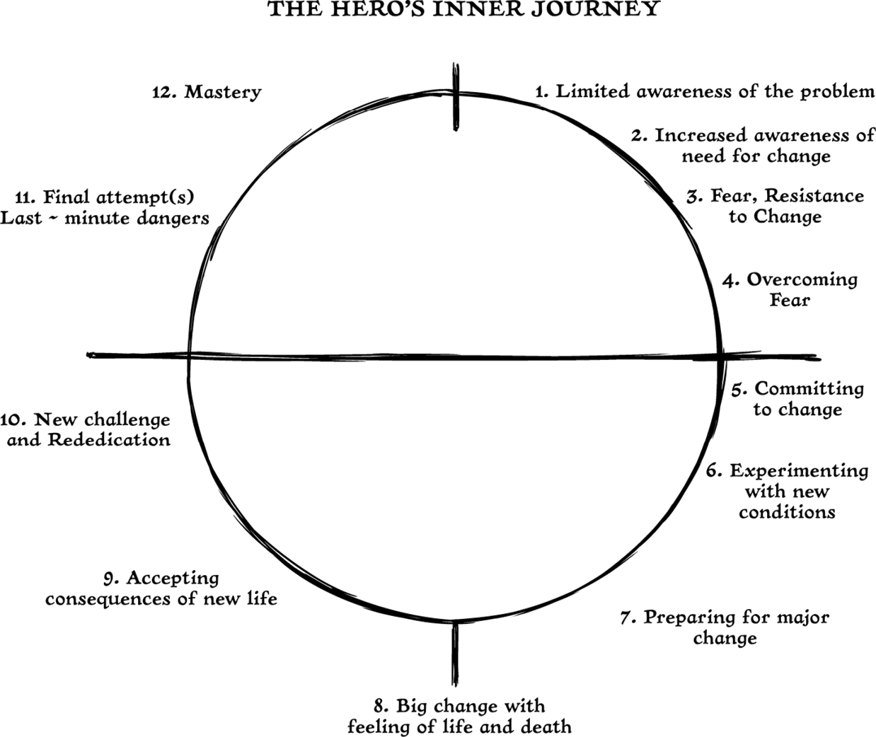
Figure 9-2
An interpretation by screenwriter Chris Vogler of the Hero’s Inner Journey, in which he argues that the protagonist changes right from the beginning2
Kurt Vonnegut’s Shapes of Stories
American novelist Kurt Vonnegut went one step further and looked at types of scenarios in traditional storytelling. During his time at the University of Chicago, he pitched a master’s thesis on the shapes of stories. Although it got rejected, reportedly because it looked like too much fun, what Vonnegut aimed to do was to plot all the stories of mankind onto a simple graph. The vertical axis represented ill to good fortune, and the horizontal axis moves from the beginning to the end of the story.
While nothing came of the thesis, Vonnegut spent the rest of his life championing the theory and describing it in his lectures and writing.3
Man in Hole
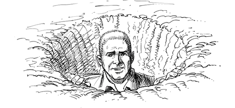
In Man in Hole (Figure 9-3), the main character gets into trouble and has to get out of it, ending up better for the experience. Harold & Kumar Go To White Castle and Arsenic and Old Lace are examples of this type of story.
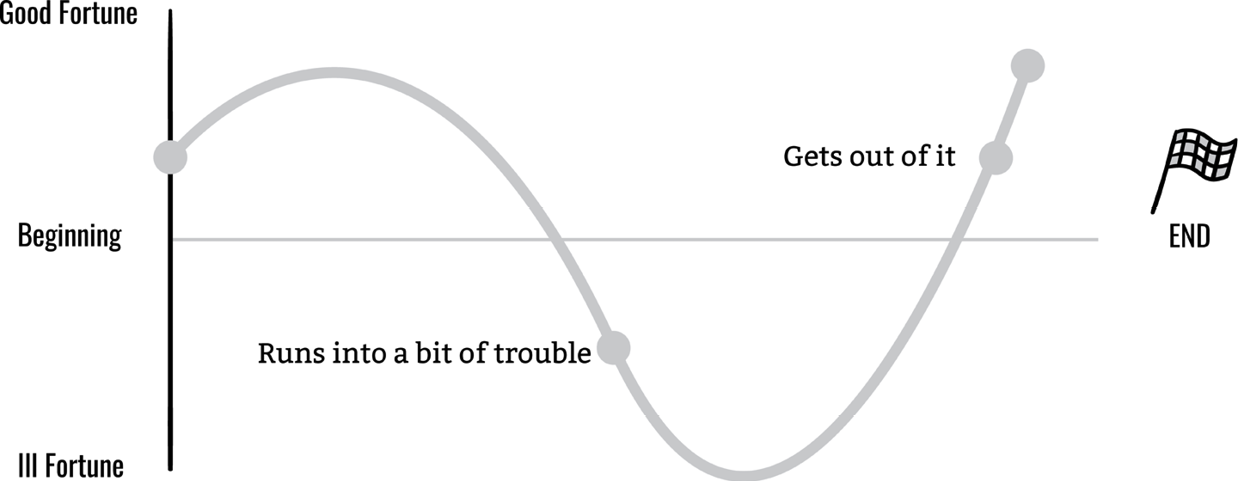
Figure 9-3
Man in Hole (Illustration by Eugene Yoon courtesy of fassforward)4
Boy Meets Girl
In Boy Meets Girl (Figure 9-4), the main character comes across something wonderful, gets it, loses it, and then gets it back forever. Examples are Jane Eyre and Eternal Sunshine of the Spotless Mind.
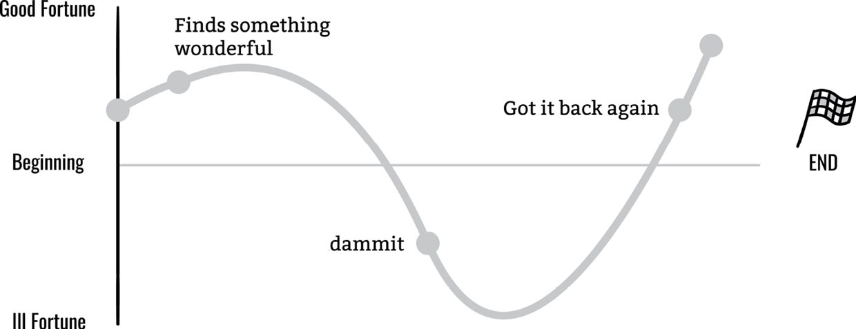
Figure 9-4
Boy Meets Girl (Illustration by Eugene Yoon courtesy of fassforward)
From Bad to Worse
In From Bad to Worse (Figure 9-5), things start out poorly for the main character and get continuously worse, with no hope for improvement. The Twilight Zone and The Metamorphosis are examples of this type of story.
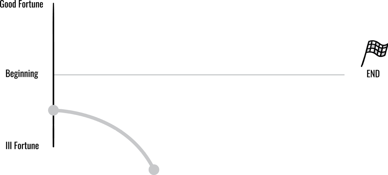
Figure 9-5
From Bad to Worse (Illustration by Eugene Yoon courtesy of fassforward)
Which Way Is Up?
Which Way Is Up? (Figure 9-6) stories have an ambiguity that keeps us wondering about, and from knowing whether, any new developments are good or bad. Examples of this type of story are Hamlet and The Sopranos.
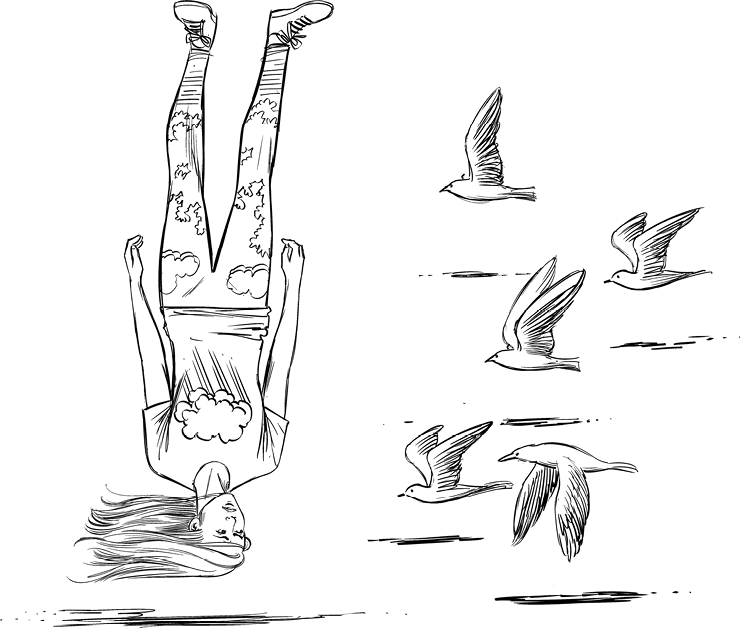
Figure 9-6
Which Way Is Up?
Creation Story
In Creation Story (Figure 9-7), humankind receives incremental gifts from a deity. First major ones, like the earth and the sky, and then smaller things. This is not a common structure in Western stories, but it appears in the creation story of many cultures.
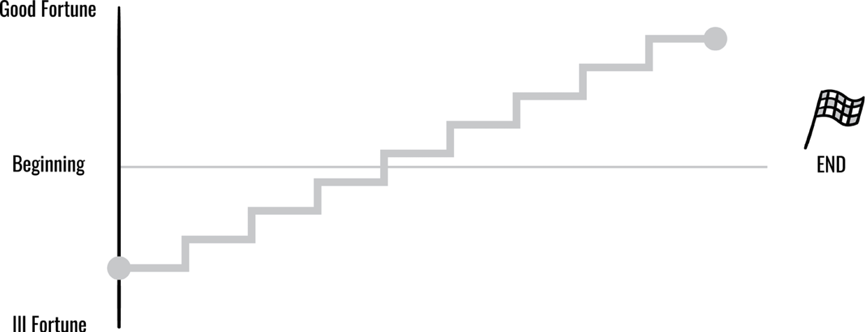
Figure 9-7
Creation Story (Illustration by Eugene Yoon courtesy of fassforward)
Old Testament
In Old Testament (Figure 9-8), which is similar to the Creation Story, humankind receives incremental gifts from a deity, but is suddenly ousted from good standing in a fall of enormous proportions. Great Expectations is an example of this type of story.
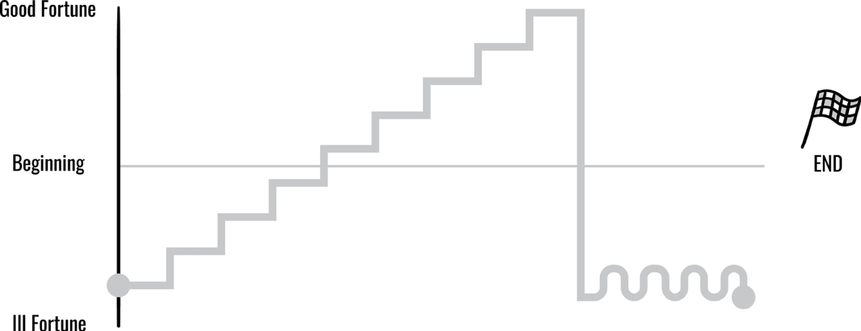
Figure 9-8
Old Testament (Illustration by Eugene Yoon courtesy of fassforward)
New Testament
In New Testament (Figure 9-9), humankind also receives incremental gifts from a deity and is suddenly ousted from good standing, but receives off-the-chart bliss following it. Great Expectations with Dickens’ alternative ending is an example of this kind of story.
Figure 9-9
New Testament
Cinderella
Cinderella (Figure 9-10) is similar to New Testament and is also what thrilled Vonnegut for the first time in 1947 and continued to do so over his years.
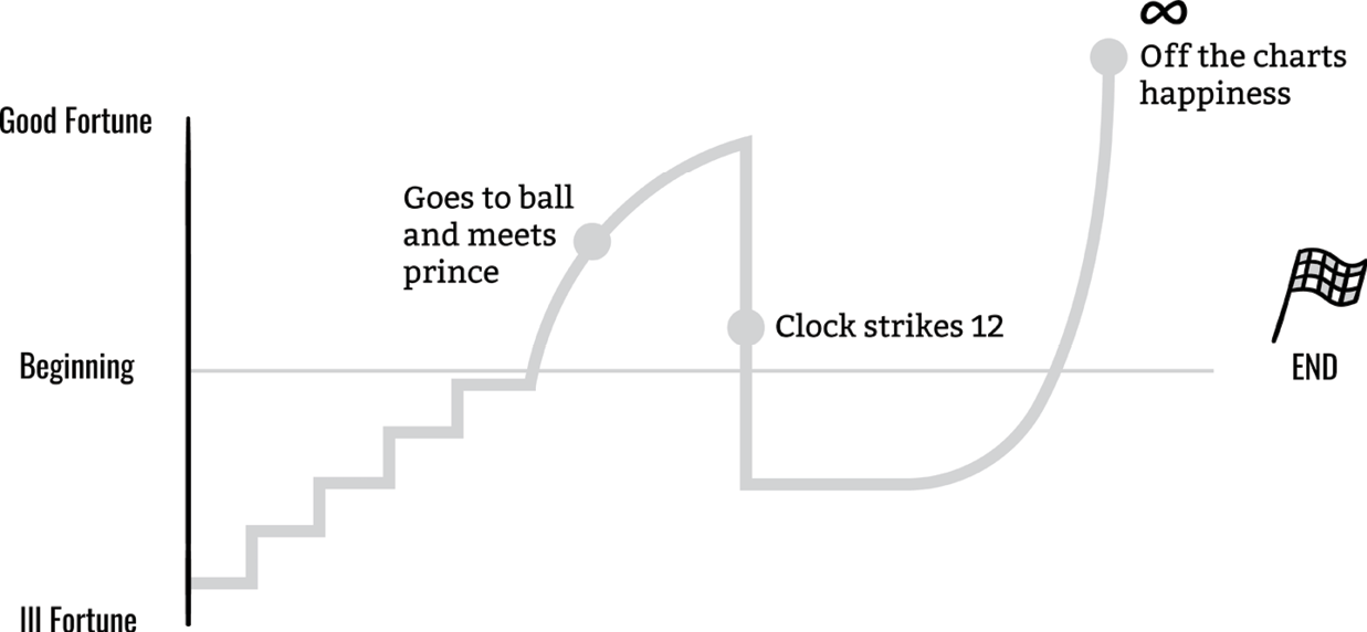
Figure 9-10
Cinderella (Illustration by Eugene Yoon courtesy of fassforward)
Booker’s Seven Basic Plots
Someone else who dedicated a large part of his life to the shape of stories is the British journalist and author Christopher Booker. In 2004, he published The Seven Basic Plots, in which he argues that every myth, every film, every novel, and every TV show follows one of seven story structures. It took Booker 34 years to complete the book, which is an analysis of stories, their psychological meanings, and why we tell them.
Overcoming the Monster
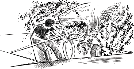
In Overcoming the Monster (Figure 9-11), the protagonist sets out to defeat an often evil monster that is threatening the protagonist and/or the protagonist’s homeland. Examples of this type of story are the James Bond series, Harry Potter series, Star Wars: Episode IV—A New Hope, Jaws, and The Magnificent Seven.
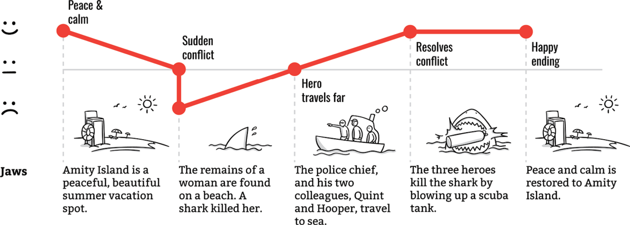
Figure 9-11
Overcoming the Monster (Illustration by Eugene Yoon courtesy of fassforward)
Voyage and Return
In Voyage and Return (Figure 9-12), the protagonist travels to a strange land. On that journey, the protagonist overcomes the threats that the strange land poses before returning with nothing more than the experience, but is better off for it. Typical examples of this type of story structure are The Odyssey, The Wizard of Oz, Alice in Wonderland, The Hobbit, Gone with the Wind, The Chronicles of Narnia, Apollo 13, and Gulliver’s Travels.
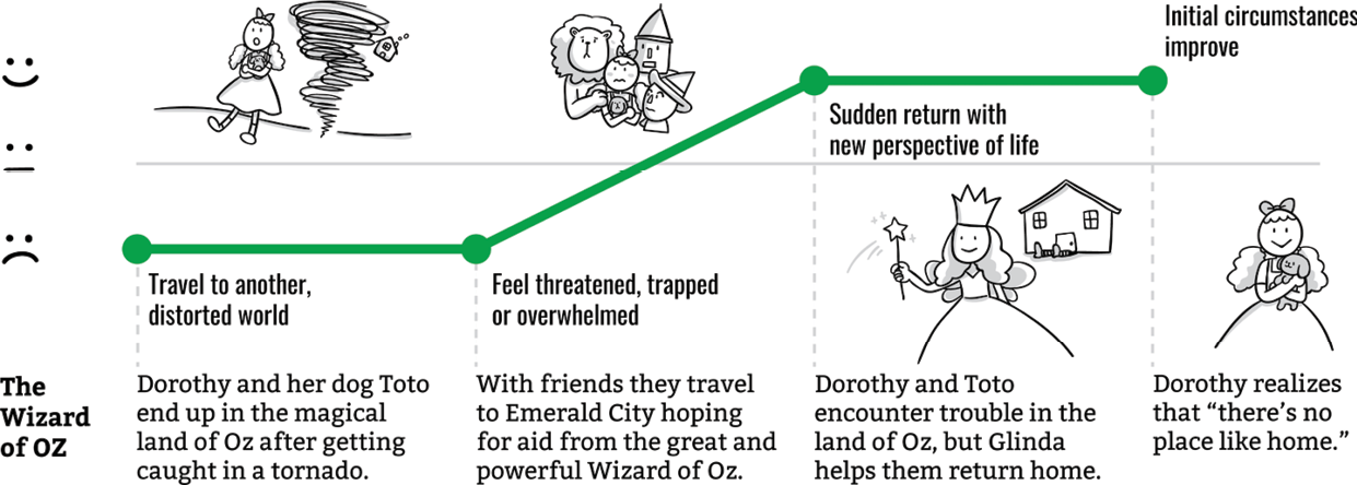
Figure 9-12
Voyage and Return (Illustration by Eugene Yoon courtesy of fassforward)
Rags to Riches
In Rags to Riches (Figure 9-13), the poor protagonist acquires the likes of wealth, power, or a friend, loses it all, and then gains it back, growing as a person in the experience. Cinderella, Aladdin, Brewster’s Millions, David Copperfield, and Great Expectations are all examples of the Rags to Riches story structure.

Figure 9-13
Rags to Riches (Illustration by Eugene Yoon courtesy of fassforward)
The Quest
In The Quest (Figure 9-14), the protagonist sets out with companions to acquire an important object or to get to a specific location, facing many obstacles, dangers, and temptations along the way. Examples of this type of story are The Lord of the Rings, Indiana Jones, The Illiad, and The Land Before Time.
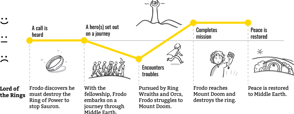
Figure 9-14
The Quest (Illustration by Eugene Yoon courtesy of fassforward)
Tragedy
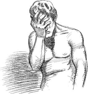
In Tragedy (Figure 9-15) the protagonist is a hero with one major flaw, or great mistake, that ultimately is their undoing and leads them on a downward spiral, evoking pity along the way. Macbeth, Anna Karenina, Romeo and Juliet, Hamlet, and Breaking Bad are all examples of tragedies.
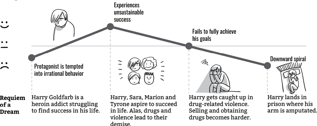
Figure 9-15
Tragedy (Illustration by Eugene Yoon courtesy of fassforward)
Comedy
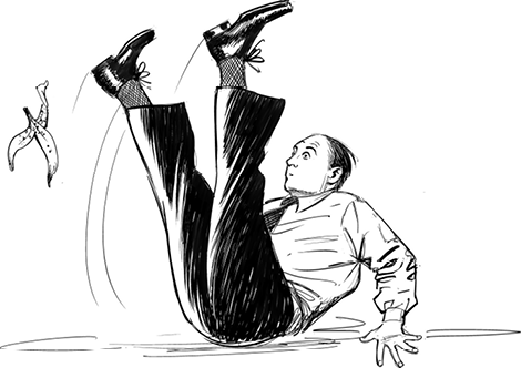
In Comedy (Figure 9-16), which has a light and humorous nature, the protagonist triumphs over adverse circumstances that often get more and more confusing but always lead to a happy ending. Most romances fall into this category. Some examples of the Comedy story structure are Four Weddings and a Funeral, Bridget Jones’s Diary, Mr. Bean, A Midsummer Night’s Dream, and Much Ado About Nothing.
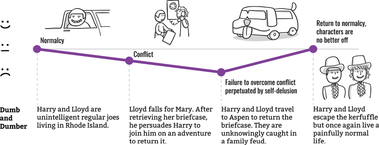
Figure 9-16
Comedy (Illustration by Eugene Yoon courtesy of fassforward)
Rebirth
In Rebirth (Figure 9-17), an important event forces the main character to change their ways, often leading them to becoming a better person. Typical examples are Beauty and the Beast, The Snow Queen, A Christmas Carol, Peer Gynt, The Secret Garden, Despicable Me, and How the Grinch Stole Christmas.
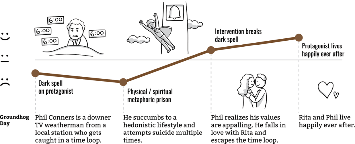
Figure 9-17
Rebirth (Illustration by Eugene Yoon courtesy of fassforward)
The Shapes of Experiences
In 2016, a group of students at the Computational Story Lab at the University of Vermont set out to test whether Vonnegut’s thesis held true. Vonnegut hypothesized that the emotional arcs invoked by the story structures he defined could be fed into a computer. However, the group of students used computers to find the shapes. Rather than look at the story structure, they analyzed the emotional arc that is invoked by the words that are used, using a filtered subset of 1,327 stories from Project Gutenberg’s fiction collection. Their test concluded that there is strong support for six core emotional arcs. One of their conclusions was that understanding emotional arcs can be beneficial when constructing arguments, but also when teaching artificial intelligence.5
Although some of the story structures may be less relevant for the types of product or service experiences we work on (hopefully, there isn’t too much tragedy by deliberate design), we can take a great deal of inspiration from some of them, even if we don’t work with artificial intelligence. The Quest, for example, applies well to a situation where the user needs to find information, book something, or buy something, like the bath my partner and I had to first research and then buy.
Two Ways to Define the Shape of an Experience
Visualizing and knowing the shape of the story and experience that you’re designing helps make it more tangible. These types of visualizations can help us define, and identify with, the user’s emotional journey when using our product or service. They are also great for thinking through when the user is in a mindset where our product or service can be of relevance and help to them. Additionally, visualizations can help us make sure we consider and define the state of mind/need the user was in before coming to us—an aspect we often don’t include, but one that can have a profound impact on the user’s overall experience and expectations.
Mapping part of an experience is something we know from customer journey maps and, to some extent, customer experience maps, depending on what they include in the visualized part of the map. In the former, you evaluate an experience, most often a specific user journey, and map it across an emotional spectrum, usually spanning from happy to unhappy. In the latter, you look at the whole end-to-end experience.
Both are great tools for mapping out the current experience and the future desired one. As both are covered elsewhere in detail―(see, for example, Mapping Experiences by Jim Kalbach―and Chapter 8), we won’t go into detail here but instead look at two other ways related to storytelling that can help you map, plan, and visualize what the experience should feel like:
Using experience goals to map the emotional journey
By using experience goals and mapping these across emotional spectrums for each stage of the product life cycle, we create a shared view of what the experience of the product we’re working on should feel like. It’s a great tool for helping prioritize requirements as well as for aligning teams, stakeholders, and clients on a shared and clearly articulated product vision.
Mapping the happy and unhappy journey
We tend to focus on and design for the ideal scenario, in which things go smoothly. The reality often looks somewhat different. Mapping the happy and unhappy paths helps us think through what an experience would be like if everything really went the ideal way, as well as what it would be like if everything went wrong. The most realistic scenario is that we’ll end up somewhere between the two. Going through this exercise is great, not just for multidevice projects, but also for campaigns and product launches. This process also forms a solid basis for thinking through and creating a customer service action plan and for communications in general.
Using Experience Goals to Map the Emotional Journey
Just as films, books, or TV series often have a number of storylines that run through them, you can define multiple experience goals for your website or app experience. On the Sony Ericsson project, we had four overarching experience goals, one of them being “.com knows me and what I want.” By subsequently breaking these down into experience statements for each product life cycle stage of the experience, you help identify and define the ambitions and challenges for your product or service, and what the experience should feel like for the user.
We mapped the experience statements across the emotional level they should correspond with and divided the statements into three levels:
Hygiene
The qualifiers that have to be there to ensure the experience is useful, easy, and simple (e.g., receiving an order confirmation, easy to find contact information)
Feel good
The differentiators that evoke a positive emotional response in the user around the innovativeness and uniqueness of the experience (e.g., getting relevant product recommendations, a product comparison tool that highlights differences)
Delight
The aspects that bring a bit of euphoria to the experience, thereby energizing the user (e.g., unexpected touches, making setup of new device seamless)
By placing the experience statements across the hygiene-to-delight spectrum, you start to see a flow that corresponds to the emotional level that the user might be going through, just as in Nancy Duarte’s analysis of great speeches, Vonnegut’s shapes of stories, and Booker’s seven basic plots.
Not everything can be on the delight level, nor should we aim to position everything there. Good needs bad, rain needs sunshine, and just as the boat won’t sail by moving backward and forward, “delights” and “feel goods” wouldn’t exist unless they were put in contrast with each other and the hygiene factors. Additionally, there are certain things that users will never be ecstatic about and that, if given the choice, they would rather not do—like filling in forms, or remembering and entering their password.
There are, however, things we can do to make these experiences more pleasurable. Experience goals combined with the pain and pleasure points we’ve identified can help us define what these things should be. Perhaps we can break a long form into more bite-sized sections to foster a sense of ease and progress. Or perhaps we can provide contextual help and validation throughout to assist in the completion process and give the feeling that someone is there with the user, guiding them through it.
Through defining your experience statements and mapping them across the three levels, you get a better understanding of whether the narrative structure you had in mind is suitable for your product and for your user’s journey. Additionally, with clearly defined overarching experience goals as well as statements, you should, at any given point throughout the experience of a website or app, be able to say how that point in the experience translates as an emotive feeling. It’s a little like the exercises I sometimes do with my partner, practicing his lines from random starting points to see if he knows where in the script he is and where to go next.
How to go about it
In terms of how to go about defining and mapping experience goals, I recommend the following five steps:
1. Brainstorm experience goals
Using any identified objective and/or key success factor for the experience, brainstorm experience goals for the product and write them down on individual sticky notes. These experience goals should be written from the user’s point of view. For example, imagine that you ask the user, “How would you describe the experience of using Sonyericsson.com?” A possible answer is, “It’s easy to find what I need.”
2. Identify patterns and write down keywords
Review the brainstorm output and group the sticky notes into clusters of statements with a common theme. Write down some keywords for each grouping; for example, “Intelligent, tailored, personalized.”
3. Formulate three to five overarching experience goals
Based on the keywords and the associated brainstorm statements, formulate three to five overarching experience goals. Just as in step 1, write them in a way that a user would express them and then shorten them; for example, “It feels like the website knows me and what I want” becomes “.com knows me and what I want.” Use different-colored sticky notes for each overarching goal.
4. Define and map detailed experience goals
Identify key experience statements for each experience goal and map them over the three levels―(hygiene, feel good, and delight)―for each stage in the life cycle. These become your detailed experience goals. Just as in steps 1 and 3 write these in a way that a user would express them; for example, “.com gives me relevant recommendations” for the consideration stage.
5. Review the output
With the three to five overarching experience goals divided into experience statements that are mapped across the three levels, review the output.
- Is the emotional journey realistic? Are there too many on the delight level?
- Does the output correctly reflect where key barriers are, and where key differentiators are or should be in relation to competitors?
- Does it correspond with a likely emotional experience for the user?
I advise working with sticky notes and a big wall space to begin with so that it becomes a collaborative exercise in which key stakeholders and team members can participate, and so that it’s easy to move things around.
Once you’re happy with the output, assign someone to make a digital version that can be shared with the wider team and clients. This digital version can be included in any presentations as well as be printed out and put on a wall to ensure that people keep it in mind during the rest of the product design process.
Mapping the Happy and the Unhappy Journey
When working through the experience of our products and services, it makes sense to start with success. Our focus should, after all, be to provide as good of an experience as possible. But the blue sky scenarios we often define in user journeys seldom reflect reality, or what is the likely reality. And that’s fine. We use these success scenarios to help identify what we aim for and want the experience to ideally be like. But we should also think about worst-case scenarios and what the experience would look like if everything went haywire.
Ideas often come from seeing things that can be improved, and identifying what would be a bad experience helps us put “good” into perspective. By plotting out the unhappy journey in addition to the happy one, we’re forced to think through, for each step or stage, what a bad experience at that point would be. It helps us identify what we should avoid both then and there and as an extension of that (e.g., automatically turning on sharing check-ins to Twitter, as we covered in Chapter 7). Considering the unhappy journey also helps us identify where we need to offer support and guidance to a user, or where we could improve; for example, ensuring that we add a way to track an expected delivery in a “product dispatched” confirmation email.
In summary, the value of mapping out both the happy and the unhappy journey lies in the following:
- Helping us being clear about what would constitute both “good” and “bad” outcomes or aspects from a user’s point of view at each step or stage of our product experience
- Identifying opportunities for improvement
- Identifying areas where things could go wrong and where we need to offer help, support, and/or guidance
How to go about it
As for for how to map the happy and unhappy journey, I recommend the following four steps:
- Identify the experience to work through. This can be a specific journey or an overall experience life cycle.
- Define and map out the happy journey.
- Define and map out the corresponding unhappy journey.
- Arrange each point in the happy and unhappy journey along an emotional spectrum.
While these cover how to use the happy and unhappy journey, other ways of using it include the following:
- For planning out campaigns and product launches across touch points
- As a customer service blueprint with references to (other) guidelines and documents at each stage
When and How to Visualize an Experience
As with most things in UX and product design, what to do and how to do it depends on the value that it adds to a project. However, scriptwriters use the methods we covered in Chapter 5, at the beginning of their writing process for a reason: it helps with the narrative structure of the story. Similarly, the two methods we’ve discussed for visualizing the shape of an experience add the most value if they are carried out at the beginning of a project, before any wireframing, prototyping, or visual design has taken place.
As for how you visualize the narrative shape of the product experiences you design, you can use the following questions to guide you to the right level of fidelity:
Who do the narrative shapes need to be shared with?
If the narrative shapes are mainly being used internally, then pen and paper, a whiteboard, or sticky notes might be all you need. Translating it into a digital document may not necessarily add any more value to the project, but instead take up time that could be better spent elsewhere. However, if you don’t have access to wall space where the narrative shape of the experience for all to see, or if you have additional internal stakeholders or clients that benefit from seeing the output, then translating it into a digital format could be worthwhile.
How are they being used in the project?
The benefit of design tools like narrative shapes is that you can keep developing and adding to them as the project progresses. If you intend to do so, ensure that the narrative shapes are accessible so that they’re easily updated. At times, this works perfectly well with pen and paper, sticky notes, or a whiteboard. At other times, it may result in a lot of rework that would be quicker and easier to complete in a digital format. If the latter is the case, develop the first version of the narrative shapes in physical form and from then on work on it digitally, and if possible, print out the output in large format.
How important is the visual presentation?
I’ve seen and been part of teams that have included sketches in presentations shared with clients, to great success. For some companies and clients, this works. For others, it doesn’t, and a more designed and visually pleasing output is needed. Most people can substantially improve their visual presentation style with some simple styling tips and tricks. While I’d generally recommend that you practice this because you will learn and become better at it, at certain times, getting the help of a designer can be a better use of everyone’s time overall.
Summary
There is a lot of power in bringing something to life and making it more tangible. Visualizing the shape of a product experience is one way to help see, and show others, how the different parts of the experience come together to make up a whole. It also helps create shared clarity of what that experience might feel like in terms of emotional highs and lows for the user. Visualizing the shape of a product experience can help spark ideas, or help us spot where we might want to make small adjustments to ensure that the experience resonates better, emotionally, with our users. And it can help us plan out for all eventualities, the happy and the unhappy ones.
The kind of exercises we’ve covered in this chapter are also a great way to get people from different parts of the organization to work collaboratively on how something is and how something should be. As with all the methods in this book, you are encouraged to adapt and make them yours so that they work even better for your specific project.
While all products and all projects are different, commonalities exist between them, and visualizing their shapes forms a good foundation for the part we’ll cover next: working with main plots and subplots in user journeys and flows.
1 “Hero’s Journey,” Wikipedia, https://oreil.ly/gN2d1.
2 Allen Palmer, “A New Character-Driven Hero’s Journey,” Cracking Yarns (blog), April 4, 2011, https://oreil.ly/Ldk-_.
3 Kurt Vonnegut, “At the Blackboard,” Lapham’s Quarterly, 2005, https://oreil.ly/FFHZ2; Robbie Gonzalez, “The Universal Shapes of Stories, According to Kurt Vonnegut,” Gizmodo, February 20, 2014, https://oreil.ly/Q5DEz.
4 Originally published in “Use these story structures to make messages people talk about,” https://oreil.ly/xiHml. Illustrations by Eugene Yoon.
5 Andrew Reagan et al., “The emotional arcs of stories are dominated by six basic shapes,” EPJ Data Science 5, no. 31 (2016), https://doi.org/10.1140/epjds/s13688-016-0093-1.
